Struggling to mix natural-looking skin tones in oil paint? You’re not alone. Many beginners end up with colours that look too orange, too pink, too muddy or lifeless. It’s a journey I’m on as an artist and it gets easier with practise. And the good news is that you don’t need a huge collection of paints to get it right.
In this beginner’s guide, you’ll learn how to mix realistic skin tones in oil paint using a simple palette, plus practical tips to make your portraits look more lifelike.
Best Oil Paint Colours for Skin Tones
To keep things simple and effective, start with a limited palette. You can make a start with just this simple selection:
- Titanium White
- Yellow Ochre
- Cadmium Red
- Burnt Umber
- Ultramarine Blue
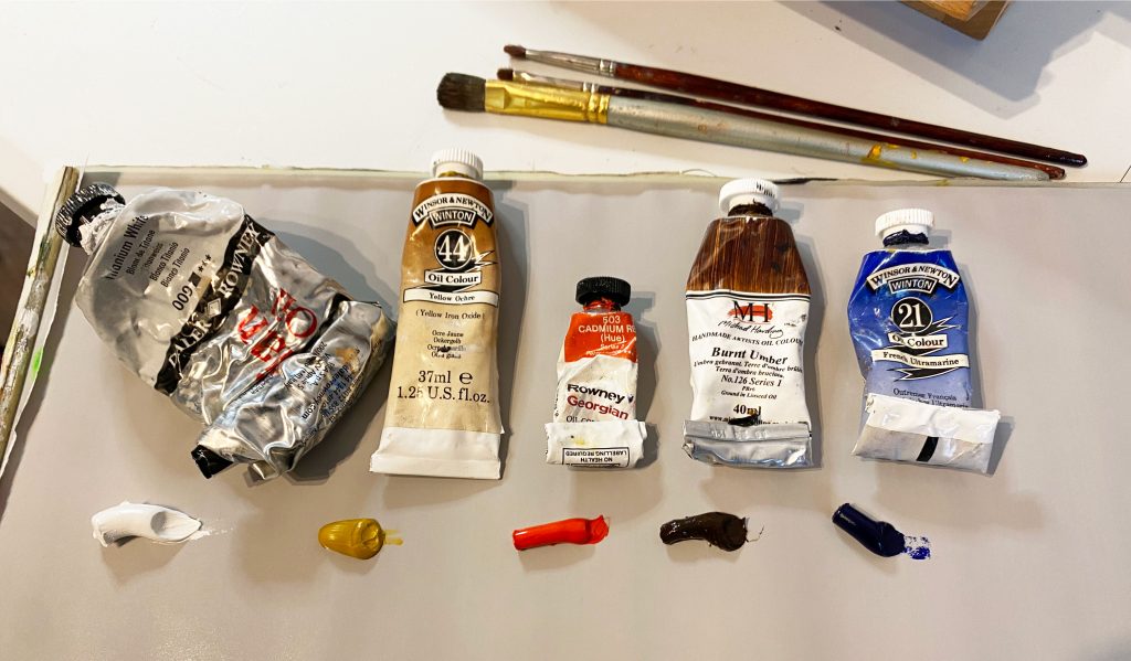
L-R Titamium White, Yellow Ochre, Cadmium Red, Burnt Umber & Ultramarine Blue. You’ll notice my palette is a mid-tone grey, this helps to gauge the lightness or darkness of the paint I mix.
These five colours are enough to mix a wide range of skin tones—from light to dark, warm to cool. Using a limited palette helps you better understand how to mix skin tones in oil paint rather than relying on pre-made colours. It will teach you how to ‘correct’ your mix as you go.
Why Skin Tone Isn’t Just One Colour
One of the biggest beginner mistakes is treating skin as a single flat colour. In reality, skin includes:
- Warm tones (reds, oranges, yellows)
- Cool tones (blues, purples)
- Subtle shifts based on light and blood flow
For example:
- Cheeks and nose tend to be warmer
- Jawlines and shadows are often cooler
Learning to see these differences is key to painting realistic skin.
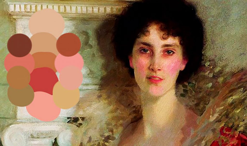
Winifred Duchess of Portland by John Singer Sargent. TIP: If you have a photo reference, it’s useful to study skin tone variations digitally with a colour-picker.
In the above image the saturation is increased to demonstrate the range colours across the face. Notice the cooler tones as you get to the shadow off the jaw and under the chin on the bottom left.
How to Mix a Basic Skin Tone in Oil Paint
Here’s a simple step-by-step method:
- Mix yellow ochre + red to create a warm orange base
- Add a small amount of blue to tone it down
- Lighten the mixture with white
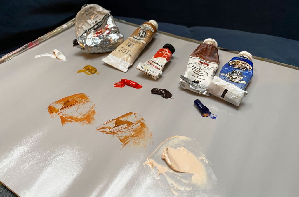
Mix 1 (above left) yellow ochre and cadmium red results in a warm orange; Mix 2 has the addition of a tiny bit of ultramarine blue; Mix 3 is a pale skin tone using Mix 2 + white
From there, adjust:
- Too orange? Add more blue
- Too pink? Add yellow ochre
- Too dark? Add white
When adjusting the tone be sparing with the paint! It’s easy to add too much. Following the above gives you a solid starting point for most skin tones.
How to Create Light, Midtone, and Shadow Skin Tones in Oil Paint
To make your painting look realistic, you need variation.
Highlights
- Add more white
- Warm slightly with yellow or red
Midtones
- Stay close to your base mix
- Make small, subtle adjustments
Shadows
- Use burnt umber or ultramarine blue to darken
- Keep shadows slightly cooler
Avoid using black—it can be too harsh and make skin tones look muddy and unnatural.
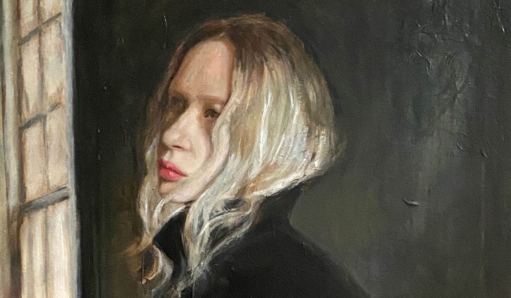
Self-portrait (detail) Becky McCarthy Studio. Fot the full range of original paintings click HERE.
Understanding Warm and Cool Skin Tones
Skin temperature changes across the face:
- Forehead: slightly yellow
- Cheeks: more red
- Chin and temples: cooler
Instead of blending everything into one colour, allow these variations to show. This is what makes portraits feel alive.
Blending Skin Tones in Oil Paint
Oil paint is great for blending, but it’s easy to overdo it. Avoid mixing your paint on the painting itself….it’s tempting to do this, but can lead to muddy colours.
- Blend softly between tones
- Keep some brushstrokes visible
- Avoid over-smoothing the entire face
A bit of texture adds realism and character.
Common Mistakes When Mixing Skin Tones
- Using black instead of mixing dark tones
- Making all skin tones too orange or too pink
- Ignoring warm vs cool variations
- Adding too much white, creating a chalky look
Avoiding these mistakes will instantly improve your results.
Painting Different Types of Skin Tones
Many of my portraits have been self-portraits so I’ve had more practice at pale skin tones. However my recommendations of a simplified palette for painting darker skins would be to include a deep red like Alizarin Crimson and a warm brown like Burnt Sienna.
And for some additional tips check out Miriam Hoffman’s notes on mixing skin tones in this YouTube video. The luminosity of the skin tones she paints is an inspiration!
Happy mixing!
For updates on any future tutorials – sign up to my newsletter HERE.